Headline views: Pickton trial perfect for page one design debate
 On Monday, the design of newspapers was the topic.
And why not, especially when there's a story as big as Robert William Pickton's trial? How do and should newspapers design headlines to get your attention when the news is as explosive and gruesome as this?
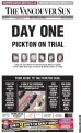
The Vancouver Sun's page-one design marking the first day of the Pickton trial was pretty dramatic.
It's a page that's hard not to notice and even harder to forget. It has the words, "Day One," in bold, 2-inch, upper case letters. Under it in smaller letters, "Pickton on Trial", and below that are the pictures of the six women Pickton is accused of murdering. You could see everywhere around town (I did on my commute to the CBC) and it garnered quite a few comments from non-newspeople.
Of course, there were questions about what is tasteful and what is not. Word choice, font size and the use of negative space all add up to some impression - it could be seen as salacious or, depending on who you are, as careful. And to get a handle on this, I spoke with a number of designers and journalists from across the country who know a thing or two about a good headline.
Gordon Preece, art director of the Winnipeg Fress Press, said, "When you look at a page like that, there's no doubt that their box sales and source sales will be up and when you see a strong headline there's no doubt what this is about."
Preece admired the clarity of the "Day One"." He said, "It is very clear typographically and the white space does add a tone of respect."
Preece also said it's hard to explain how one font size can seem respectful and yet a headline just a smidgeon larger can appear blaring and insensitive.
But ultimately, "There times you have to go big or go home."
Neil Graham did not agree with the choice.
Graham is a journalism professor at Langara and used to be the managing editor of The Province.
He said, "If you don't like this one issue, this cover will turn a reader off in general and while there's a lot who will follow the trial, there are a lot people who don't want to hear about any gore."
He prefered The Province's cover which also gave space to a shoplifting story and sports.
Tony Sutton, the man responsible for the makeover of the Globe and Mail in the 1990s, said Monday's page lacked a vigour. "Not sure what the excitement is about with the Sun's front page. Yes, it's tabloid in appearance, but has no tabloid vision or excitement - the page tells me nothing that I don't already know and it tells me it badly."
"Now, imagine what a REAL tabloid, such as the London Sun, would do with the story: it would get an exclusive angle that its rivals wouldn't have; it would give it a real headline and its presentation would make me (and you) pick it up and turn the pages."
Well, I had a chance to hear what The Vancouver Sun thinking. I visited the broadsheet's headquarters and met up with Stewart Muir. Muir is the deputy managing editor and the one responsible for the front page look that day.
Here's what he had to say. Listen, 7 min 41 sec.
Comments
Post a Comment