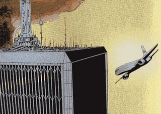
9/11 graphic novel harnesses comic book idiom

The final Kean Commission Report was a best seller. Now, a comic book version of the 9/11 commission report has just been published.
Called "The 9/11 Report: A Graphic Adaptation", it was created by two old pros: Sid Jacobsen, former editor-in-chief of Harvey Comic books and Ernie Colon. He drew Richie Rich and Casper at Harvey and also worked as the artist for DC titles including The Flash, Green Lantern and Wonder Woman.
How did they handle the sensitive subject matter?
First of all, the book takes on a serious look. Very straight forward cover. No exclamation marks or exploding captions - things you would identify with comic book covers.
Any thought that the adaption trivializes the event of September 11 are assuaged by commission chair Thomas Kean and vice-chair Lee Hamilton.
Plus, there's an extravagant blurb by Stan Lee.
Inside, Jacobson and Colon take advantage of all the comic book idioms to clarify what happened before and on 9/11.
Maybe comic books were made for sorting out complex stories like the attacks on the World Trade Center. Why? Well, superhero comic books and the artist who create them are all about convoluted plots and story continuity between titles. Something that happens in Spider-Man can have an impact on the plot in The Fantastic Four or Captain America.
I know it sounds silly but when you work in a story universe like that you become very good at sorting-out and matching-up plot lines and creating visual devices, storytelling tools, to convey the simultaneity of complex events.
That said, just about the first twenty pages of The 9-11 Report Graphic Adaptation are timelines which track the flight of all hijacked planes between the 7:59 to 10: 30 in the morning when the last plane struck the Pentagon. Organizing the information with such a simple treatment is itself a triumph.
Also, to the team's credit, the drawing style is best described as restrained. Hijackers or US officials like Vice President Dick Cheney and then National Security Advisor, Condoleeza Rice are rendered with an ostensibly neutral pen. Perhaps, once in a while then pen seems to slip and reveal a disdain for certain players but obvious editorializing is kept to a minimum.
And one thing I find remarkable is The 9/11 Report Graphic Adaptation avoids draping itself in the American flag.
I've been through the book several times and I could only find three Red, White and Blues. And usually they're within the context of a scene. For example, when President George Bush made a taped address to the nation from Barksdale Air Force base in Louisiana, you see a flag and then again during the "axis-of-evil" State of the Union address.
This work avoids the jingoism and kitschy use of the flag that you find in so many popular works inspired by what happened. It well demonstrates the level of thoughtfulness and artistic maturity of both creators. Jacobsen and Colon are serious men taking on a serious topic and their adaptation is an achievement and despite the fact it's a comic book, it's one of the least sensationalized works on 9/11 I've seen yet.
The tough part is it's hard to find in Vancouver. Apparently Blackberry Books has copies but Chapters downtown had one left and The Comic Shop on Fourth was sold out.
But you can find it online at slate.com.
Comments
Post a Comment